BEIT EZZ
Branding
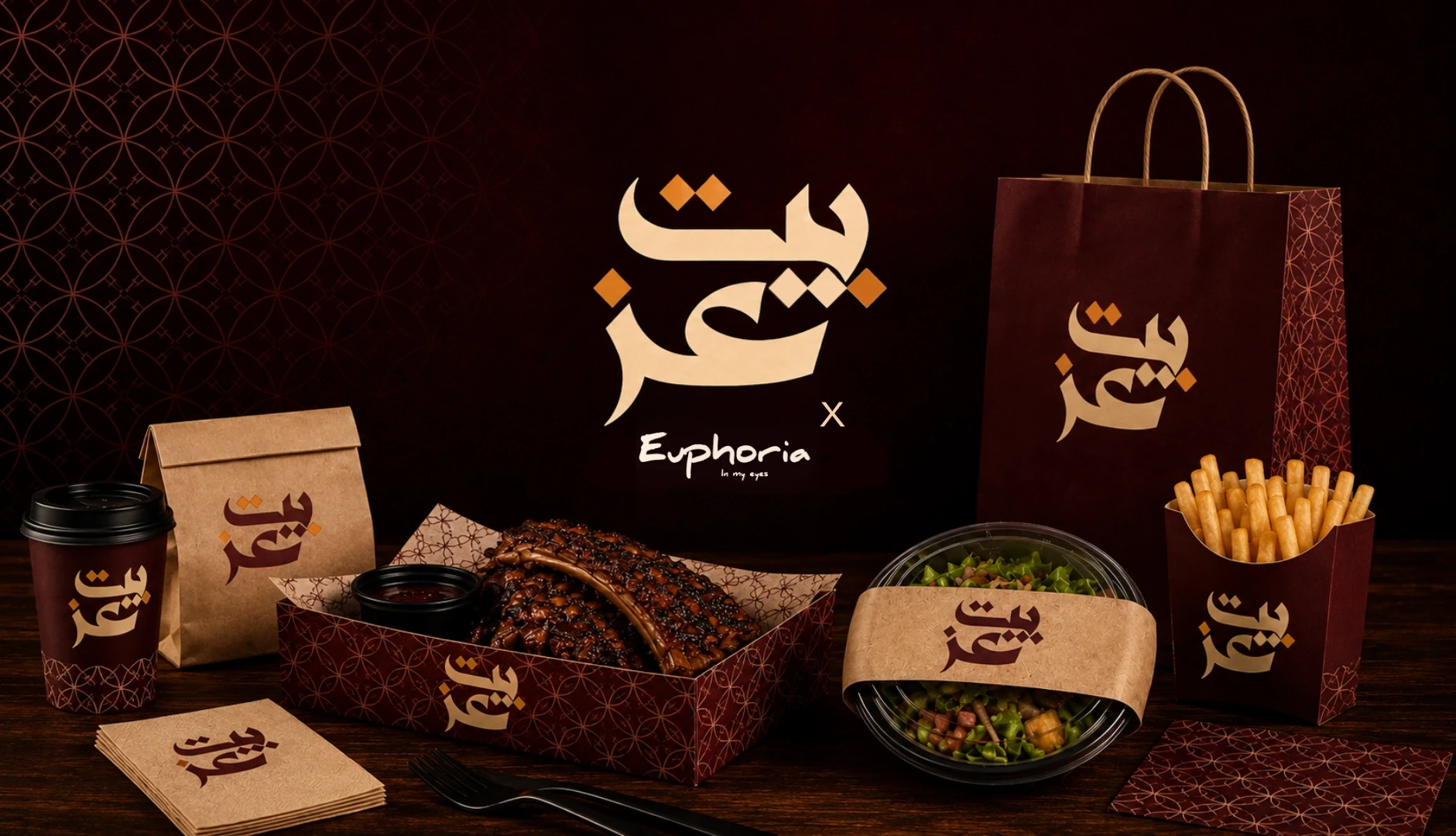
BEIT EZZ
Fujairah, UAE — 2026
Brand Identity · Packaging · Social Media · Restaurant Communication
EASTERN FLAVOR. MODERN HOSPITALITY.
Beit Ez is a Fujairah-based restaurant specializing in grilled meats and authentic Eastern cuisine, built around one simple idea: bringing the warmth, generosity, and familiarity of Eastern food into a contemporary dining experience.
The brand needed more than a logo. It needed a complete visual system that could live naturally across the restaurant, takeaway experience, packaging, delivery, and digital communication while remaining recognizable in the UAE’s highly competitive food market.
CLIENT
Beit Ez
INDUSTRY
Food & Beverage
LOCATION
Fujairah, UAE
SERVICES
Brand Identity
Packaging Design
Social Media Direction
Restaurant Communication
THE CHALLENGE
AUTHENTIC WITHOUT FEELING OUTDATED.
Eastern restaurants often compete using the same visual vocabulary: traditional ornaments, familiar colors, crowded menus, and predictable food photography.
Beit Ez needed to communicate authenticity without becoming another conventional Eastern restaurant brand.
The challenge was to create an identity that felt culturally familiar to local and Arab audiences while remaining contemporary enough for Fujairah’s diverse UAE dining market.
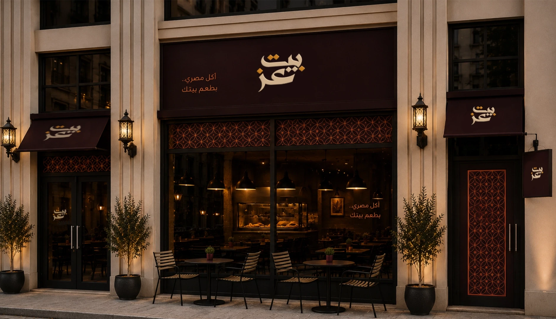
The system also had to remain consistent across multiple touchpoints — from dine-in and takeaway to delivery, packaging, signage, and social media.
THE IDEA
THE FEELING OF HOME. BUILT FOR TODAY.
Instead of treating heritage as decoration, we focused on the feeling behind Eastern hospitality.
Warmth. Generosity. Familiarity. Gathering around food.
These ideas became the foundation of the visual language.
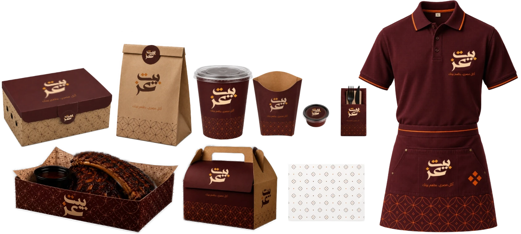
A rich burgundy palette creates warmth and appetite, natural kraft materials bring tactility and familiarity, while cream and orange accents give the identity a more contemporary and recognizable presence.
The result is an identity that feels rooted in Eastern culture without being trapped by traditional restaurant aesthetics.
VISUAL IDENTITY
WARMTH YOU CAN RECOGNIZE.
The Beit Ez identity was designed around a bold Arabic wordmark supported by a simple but flexible graphic system.
Rather than relying on heavy decorative elements, the visual language uses repetition, geometry, material texture, and controlled color to create a recognizable brand presence.
PRIMARY PALETTE
Deep Burgundy
Warm Kraft
Cream
Burnt Orange
TYPOGRAPHY
Bold Arabic Display
Clean Contemporary Sans Serif
VISUAL LANGUAGE
Warm
Confident
Familiar
Contemporary
Eastern-inspired
FOOD EXPERIENCE
THE FOOD STAYS AT THE CENTER.
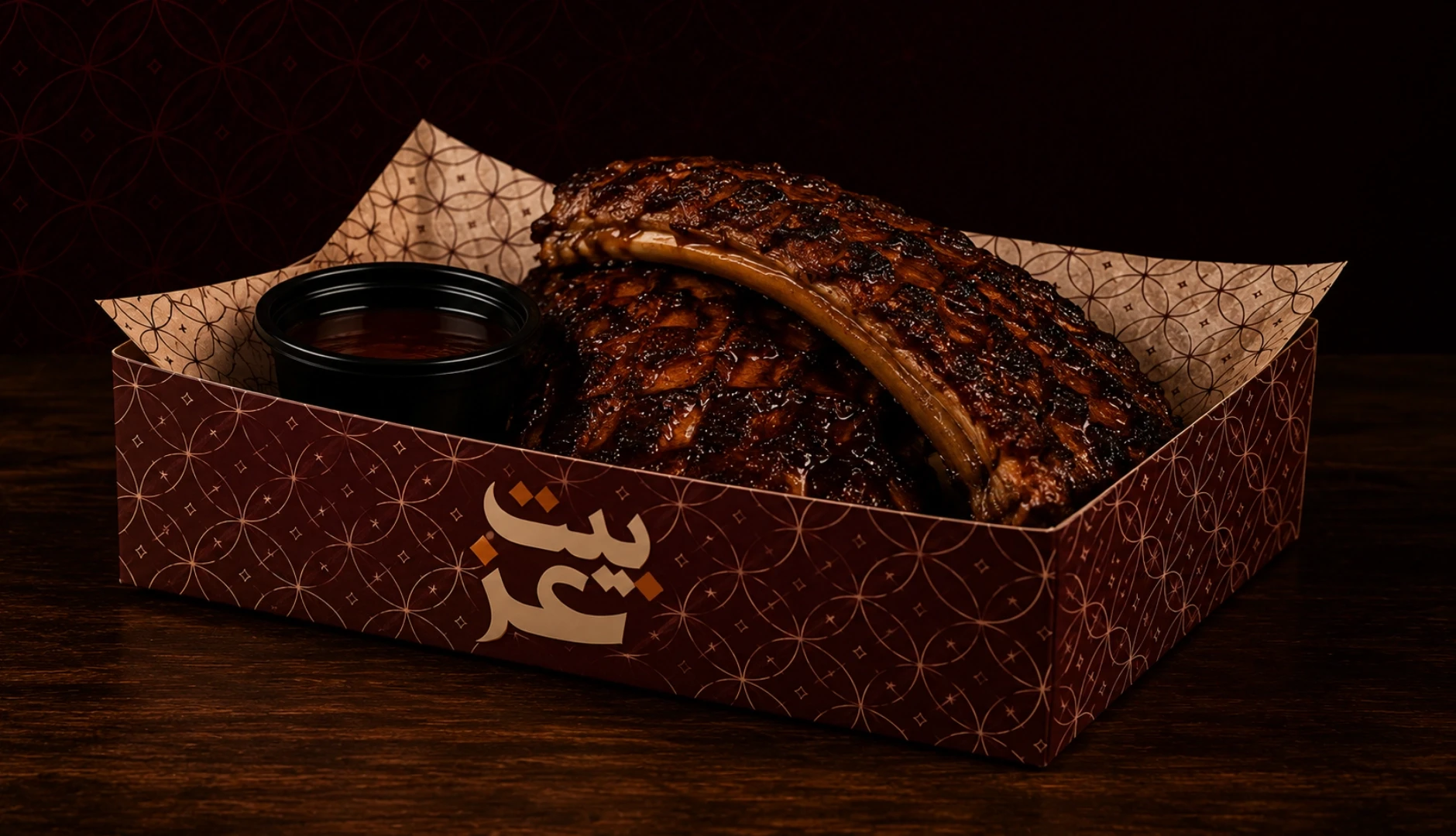
The visual identity was designed to support the food rather than compete with it.
Warm materials, dark backgrounds, and restrained graphic elements create a visual environment where grilled meats, fresh ingredients, and generous portions remain the hero.
The photography direction uses rich textures, warm lighting, and close compositions to communicate the character of the food before the customer even tastes it.
THE RESULT
A BRAND BUILT TO FEEL FAMILIAR — AND LOOK DISTINCTIVE.
Beit Ez became more than a restaurant identity.
It became a flexible visual system capable of moving naturally across food, packaging, digital communication, delivery, uniforms, and the physical restaurant experience.
A brand rooted in the warmth of Eastern hospitality, expressed through a contemporary visual language built for today’s UAE audience.
BEIT EZ × EUPHORIA IN MY EYES
Brand Identity · Packaging · Social Media · Restaurant Communication
Eastern Flavor. Modern Hospitality.
BEIT EZZ
Fujairah, UAE — 2026
Brand Identity · Packaging · Social Media · Restaurant Communication
EASTERN FLAVOR. MODERN HOSPITALITY.
Beit Ez is a Fujairah-based restaurant specializing in grilled meats and authentic Eastern cuisine, built around one simple idea: bringing the warmth, generosity, and familiarity of Eastern food into a contemporary dining experience.
The brand needed more than a logo. It needed a complete visual system that could live naturally across the restaurant, takeaway experience, packaging, delivery, and digital communication while remaining recognizable in the UAE’s highly competitive food market.
CLIENT
Beit Ez
INDUSTRY
Food & Beverage
LOCATION
Fujairah, UAE
SERVICES
Brand Identity
Packaging Design
Social Media Direction
Restaurant Communication
THE CHALLENGE
AUTHENTIC WITHOUT FEELING OUTDATED.
Eastern restaurants often compete using the same visual vocabulary: traditional ornaments, familiar colors, crowded menus, and predictable food photography.
Beit Ez needed to communicate authenticity without becoming another conventional Eastern restaurant brand.
The challenge was to create an identity that felt culturally familiar to local and Arab audiences while remaining contemporary enough for Fujairah’s diverse UAE dining market.
The system also had to remain consistent across multiple touchpoints — from dine-in and takeaway to delivery, packaging, signage, and social media.
THE IDEA
THE FEELING OF HOME. BUILT FOR TODAY.
Instead of treating heritage as decoration, we focused on the feeling behind Eastern hospitality.
Warmth. Generosity. Familiarity. Gathering around food.
These ideas became the foundation of the visual language.
A rich burgundy palette creates warmth and appetite, natural kraft materials bring tactility and familiarity, while cream and orange accents give the identity a more contemporary and recognizable presence.
The result is an identity that feels rooted in Eastern culture without being trapped by traditional restaurant aesthetics.
VISUAL IDENTITY
WARMTH YOU CAN RECOGNIZE.
The Beit Ez identity was designed around a bold Arabic wordmark supported by a simple but flexible graphic system.
Rather than relying on heavy decorative elements, the visual language uses repetition, geometry, material texture, and controlled color to create a recognizable brand presence.
PRIMARY PALETTE
Deep Burgundy
Warm Kraft
Cream
Burnt Orange
TYPOGRAPHY
Bold Arabic Display
Clean Contemporary Sans Serif
VISUAL LANGUAGE
Warm
Confident
Familiar
Contemporary
Eastern-inspired
FOOD EXPERIENCE
THE FOOD STAYS AT THE CENTER.
The visual identity was designed to support the food rather than compete with it.
Warm materials, dark backgrounds, and restrained graphic elements create a visual environment where grilled meats, fresh ingredients, and generous portions remain the hero.
The photography direction uses rich textures, warm lighting, and close compositions to communicate the character of the food before the customer even tastes it.
THE RESULT
A BRAND BUILT TO FEEL FAMILIAR — AND LOOK DISTINCTIVE.
Beit Ez became more than a restaurant identity.
It became a flexible visual system capable of moving naturally across food, packaging, digital communication, delivery, uniforms, and the physical restaurant experience.
A brand rooted in the warmth of Eastern hospitality, expressed through a contemporary visual language built for today’s UAE audience.
BEIT EZ × EUPHORIA IN MY EYES
Brand Identity · Packaging · Social Media · Restaurant Communication
Eastern Flavor. Modern Hospitality.
BEIT EZZ
Fujairah, UAE — 2026
Brand Identity · Packaging · Social Media · Restaurant Communication
EASTERN FLAVOR. MODERN HOSPITALITY.
Beit Ez is a Fujairah-based restaurant specializing in grilled meats and authentic Eastern cuisine, built around one simple idea: bringing the warmth, generosity, and familiarity of Eastern food into a contemporary dining experience.
The brand needed more than a logo. It needed a complete visual system that could live naturally across the restaurant, takeaway experience, packaging, delivery, and digital communication while remaining recognizable in the UAE’s highly competitive food market.
CLIENT
Beit Ez
INDUSTRY
Food & Beverage
LOCATION
Fujairah, UAE
SERVICES
Brand Identity
Packaging Design
Social Media Direction
Restaurant Communication
THE CHALLENGE
AUTHENTIC WITHOUT FEELING OUTDATED.
Eastern restaurants often compete using the same visual vocabulary: traditional ornaments, familiar colors, crowded menus, and predictable food photography.
Beit Ez needed to communicate authenticity without becoming another conventional Eastern restaurant brand.
The challenge was to create an identity that felt culturally familiar to local and Arab audiences while remaining contemporary enough for Fujairah’s diverse UAE dining market.
The system also had to remain consistent across multiple touchpoints — from dine-in and takeaway to delivery, packaging, signage, and social media.
THE IDEA
THE FEELING OF HOME. BUILT FOR TODAY.
Instead of treating heritage as decoration, we focused on the feeling behind Eastern hospitality.
Warmth. Generosity. Familiarity. Gathering around food.
These ideas became the foundation of the visual language.
A rich burgundy palette creates warmth and appetite, natural kraft materials bring tactility and familiarity, while cream and orange accents give the identity a more contemporary and recognizable presence.
The result is an identity that feels rooted in Eastern culture without being trapped by traditional restaurant aesthetics.
VISUAL IDENTITY
WARMTH YOU CAN RECOGNIZE.
The Beit Ez identity was designed around a bold Arabic wordmark supported by a simple but flexible graphic system.
Rather than relying on heavy decorative elements, the visual language uses repetition, geometry, material texture, and controlled color to create a recognizable brand presence.
PRIMARY PALETTE
Deep Burgundy
Warm Kraft
Cream
Burnt Orange
TYPOGRAPHY
Bold Arabic Display
Clean Contemporary Sans Serif
VISUAL LANGUAGE
Warm
Confident
Familiar
Contemporary
Eastern-inspired
FOOD EXPERIENCE
THE FOOD STAYS AT THE CENTER.
The visual identity was designed to support the food rather than compete with it.
Warm materials, dark backgrounds, and restrained graphic elements create a visual environment where grilled meats, fresh ingredients, and generous portions remain the hero.
The photography direction uses rich textures, warm lighting, and close compositions to communicate the character of the food before the customer even tastes it.
THE RESULT
A BRAND BUILT TO FEEL FAMILIAR — AND LOOK DISTINCTIVE.
Beit Ez became more than a restaurant identity.
It became a flexible visual system capable of moving naturally across food, packaging, digital communication, delivery, uniforms, and the physical restaurant experience.
A brand rooted in the warmth of Eastern hospitality, expressed through a contemporary visual language built for today’s UAE audience.
BEIT EZ × EUPHORIA IN MY EYES
Brand Identity · Packaging · Social Media · Restaurant Communication
Eastern Flavor. Modern Hospitality.
NEXT PROJECTS
NEXT PROJECTS
NEXT PROJECTS
FAQ
Clear Answers. No Guesswork.
What does Euphoria actually do?
Do you sell fixed social media packages?
Who is Euphoria best for?
What is the growth process?
What packages do you offer?
FAQ
Clear Answers. No Guesswork.
What does Euphoria actually do?
Do you sell fixed social media packages?
Who is Euphoria best for?
What is the growth process?
What packages do you offer?
FAQ
Clear Answers. No Guesswork.
What does Euphoria actually do?
Do you sell fixed social media packages?
Who is Euphoria best for?
What is the growth process?
What packages do you offer?